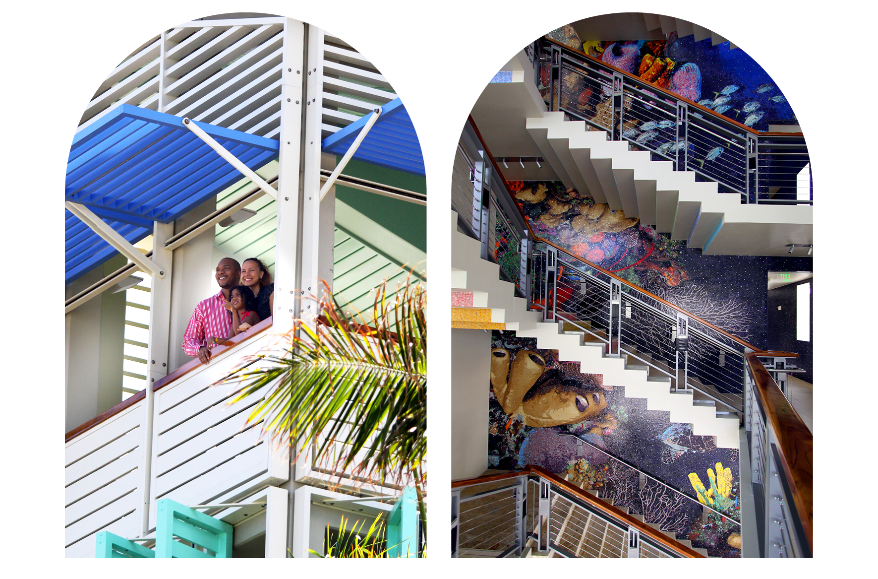
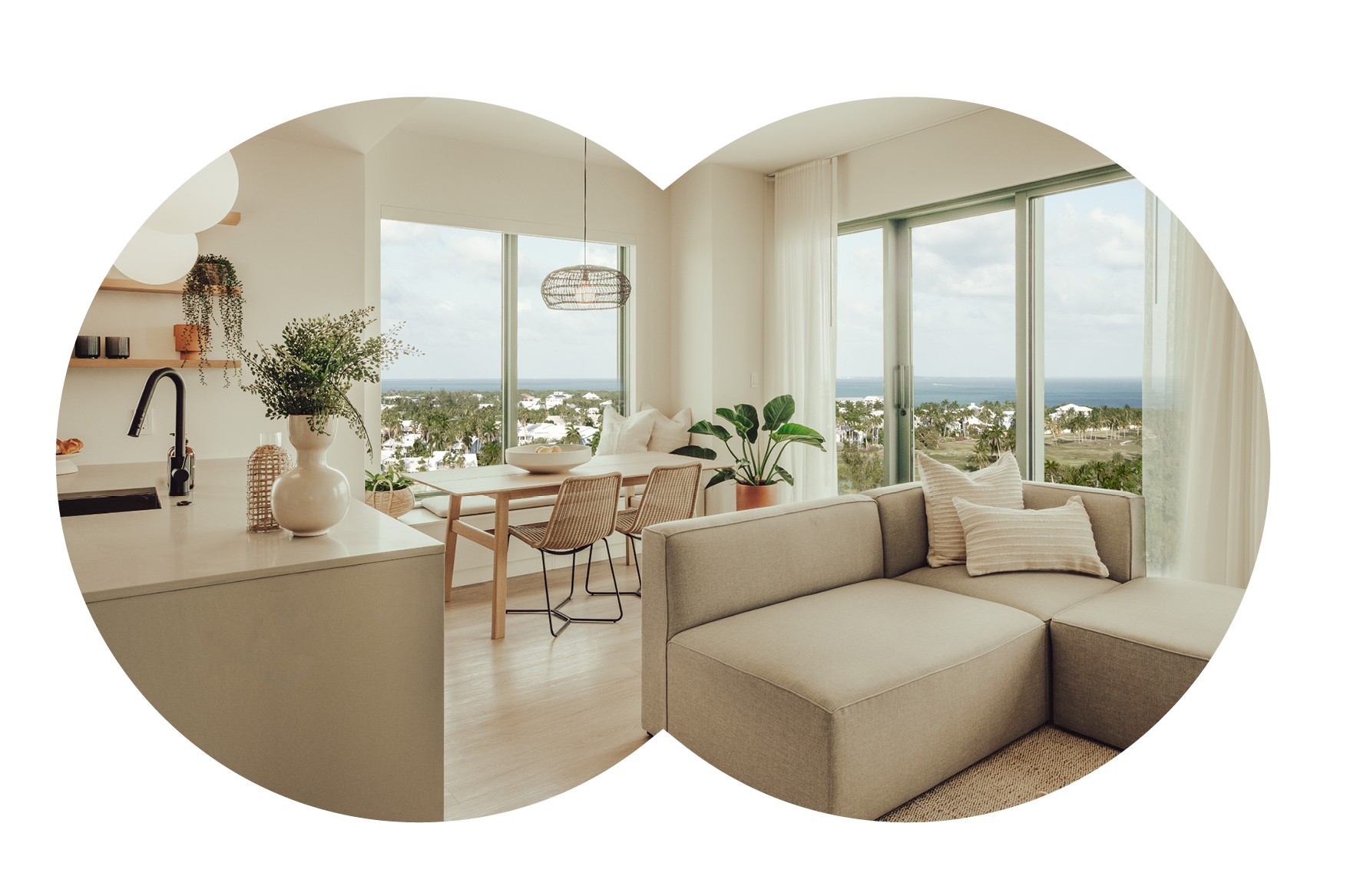
For more than 15 years, Camana Bay has been at the cutting edge of New Urbanism in the Cayman Islands – a rare walkable community where home, work and lifestyle meet. It is a beloved destination for locals, visitors and businesses alike, with 100,000 people spending time in its spaces annually and more than 3,500 living and working in its perimeters.
As the community expands, it requires more flexible visual references to support the evolving brand.
“We went back to the original design principles of Camana Bay for inspiration,” Dart Vice President Marketing Ben Leftwich shares. “We wanted to ground the evolved brand in what made Camana Bay special in the region when it first opened more than 15 years ago, while looking to the future and ensuring we established a system that could see us through continued growth.”
The care and attention to detail in the design of Camana Bay are significant parts of its appeal, with a world-class team creating this town centre on par with other mixed-use developments around the globe. And now, that same energy is being poured into reimagining Camana Bay in a way that will bolster its growth for the next 15 years and beyond.

A strong foundation
Camana Bay began with the purpose of addressing the island’s population boom and suburban sprawl, creating a sustainable town centre that could serve as a meeting place for the community and facilitate a range of activities. The thoughtful design of this haven for Grand Cayman resulted in even more demand and expansion, and with that, the need for a brand identity as dynamic as the environment itself.
The core mission remains the same, and with the explosive growth on island, it is more relevant than ever. The updated branding intends to better express that mission with a vibrancy and diversity that reflects the community it serves.
“The original identity expressed the extraordinary planning that guided the first phase of work, from the fountain by the marina to the artwork on the utility covers and the mature trees established in the nursery before building began,” design partner Sardine Academy explains. “That foundation gave us a platform upon which we could layer in new attributes.”

Why now?
The 15-year milestone in 2022 was an opportune time to reflect on Camana Bay’s purpose, journey to date and what comes next. The result was that this flourishing, mixed-use town needed a more flexible, scalable design system.
This more diversified, expressive Camana Bay aims to build greater meaning and connection to the brand for its communities, making it an even more attractive place to live, work and play.
What’s new?
Living colour
Camana Bay is recognisable by its bright, aquamarine blue, a colour strongly associated with the Caribbean location. But much like the diversity of the Cayman Islands couldn’t be represented with one colour, this singularity was no longer serving the brand. The new look expands Camana Bay’s colour palette to include more than 25 shades inspired by the environment – from the sands to the sunsets and vibrant wildlife – more accurately capturing the variety and vivacity of the community.

Made for Cayman
The inviting green landscape of Camana Bay is an important part of its story, with the incredible work done a decade before opening, making it a place where life, quite literally, blossoms. Naturally, this flora as always been integral to the community, creating comfort and shade and giving it a distinctly Caymanian feel. For that reason, the Camana Bay blossom remains at the heart of the brand, but with new iterations enabling it to be more adaptable, open and expressive. As well as continuing to appear as part of the refreshed logo, which has been given a clean, modern polish, the blossom now appears in an outline and filled version, within a single circle and standalone.
Making a mark
In addition to refining the logo, Camana Bay now has a distinct monogram that anchors a new series of patterns featuring the blossom unfolding seemingly eternally, echoing the lively, ever-evolving nature of the town centre. As well as this style stamp, a library of shapes has been created inspired by the historical archives of the Cayman Islands, bringing together the old and the new to honour the legacy of the islands while continuing to innovate. These shapes will provide windows into community happenings, and the patterns will act as eye-catching trimmings reminiscent of the thriving Camana Bay gardens.

New life blossoming
Combining these elements – a diverse and vibrant colour palette, a series of patterns and shapes, and more open, expressive features that speak to the local environment and modernity and global influences of Camana Bay – will allow new life to blossom in the community, better representing what it stands for today, tomorrow and into the future.
The updated brand identity is only the beginning of what’s next for Camana Bay, with future developments to include more offices, residences and a potential new resort district. While its values and mission remain steadfast, Camana Bay’s services and content are constantly growing, placing it among the world’s most compelling destinations for living, working and playing. This new brand system will support Camana Bay’s many offerings, helping create stronger connections with its communities.